4. Example analysis notebook
4.Example Analysis Notebook.Rmd1 Analysis Setup
In this analysis tutorial we will load the learned helplessness dataset as an experiment object and walk through the analysis and visualization functions in SMARTR with it. You can download the learned helplessness dataset here! Please see the accompanying paper for an in-depth explanation of the behavioral groups used in this experiment.
1.1 Load the libraries and data needed
library(SMARTR)
library(tidyverse)

# Install rstatix if it is not installed already
library(rstatix)
Load the experiment object
# Load the experiment data
# Change to point to the experiment object downloaded
load("P:\\DENNYLABV\\Michelle_Jin\\Wholebrain pipeline\\LH_analysis\\learned_helplessness_experiment.RDATA")

# Change where the analysis folder is stored in the experiment object
# Edit the path below to point your own folder location
attr(lh, "info")$output_path <- "P:\\DENNYLABV\\Michelle_Jin\\Wholebrain pipeline\\LH_analysis"

# print the experiment object to see what attributes are available
print(lh)
Print the names of the current data stored within the experiment object
1.2 Combine the processed cell counts across all the mice.
This concatenates the normalized regional cell count table from each
mouse into one long dataframe. The by parameter is a list
of the mouse attributes types you want to use to make analysis
subgroups. For example, you would include
by = c('sex','age') if you wanted to perform an analysis
where the data is grouped by both males and females and age of the
subjects.
In our dataset Shock and Context are stored
in the flexible generic attribute group, so we use that for
the by variable.
lh <- combine_cell_counts(lh, by = c('group'))

# print the name of stored data
print(names(lh))
There should now be a new list called
combined_normalized_counts, where each element is a
combined normalized cell count table per channel.
If there are specific regions you would like to exclude from your
analysis, you can do so using the code below by entering region acronyms
into the toremove vector. Here, we demonstrate removing the
CA2 region.
1.3 Normalize colabelled counts by a particular channel.
This is an optional step, but is particularly pertinent to those doing engram research. Sometimes we want to normalize the number of colabelled cells per region over the number of eYFP cells or c-Fos cells.
This allows users to gauge the fraction of cells “reactivated” from an original ensemble population (colabel+/eYFP+) or the number of reactivated cells as a proportion of the ensembles active during memory expression (colabel+/c-Fos+). We leave the choice to use either/both of these denominators to further analyze the data up to users.
# Normalize the colabelled counts by a particular channel
lh <- normalize_colabel_counts(lh, denominator_channel = "eyfp")


# Uncomment the following line if you would like to also analyze colabelled cells normalized by c-Fos
# lh <- normalize_colabel_counts(lh, denominator_channel = "cfos")

# Print the names of each channel cell count table. New channels, where colabelled counts are normalized by
# eyfp and/or cfos should be present.
print(names(lh$combined_normalized_counts))
The normalized colabelled counts can now be treated as an independent channel to analyze.
1.4 Quality checking all region outlier counts across all channels.
Details of these functions are covered in the mapping tutorial page. Removing all region outliers where counts above or below 2 standard deviations of the group mean are removed. This is evaluated in independently per channel.
lh <- find_outlier_counts(lh, by = c("group"), n_sd = 2, remove = TRUE, log = TRUE)Making sure a minimum of mice per group are represented in each region count.
lh <- enough_mice_per_group(lh, by = c("group"), min_n = 4, remove = TRUE, log = TRUE)2 Analysis, statistical comparisons and visualization functions
It is helpful to now conceptualize analysis as composed of two parts: 1) One function performs data wrangling or analysis behind the scenes. 2) The second function is responsible for visualization, with built-in auto-export of figures.
This section will cover the analysis and transformation of data
stored in the experiment object. Visualization/plotting, and export of
the figures from these functions will be covered in section 3. The data
output from these analyses will typically be stored in the experiment
object if it is a SMARTR package function. Depending on the
function, data can be auto-exported as a .csv file to the experiment
output folder.
2.1 Exporting formatted regional counts list with multiple comparisons correction
Generating an a formatted regional counts list with an false
discovery rate correction (FDR) can be performed with the
dplyr and rstatix package functions. A
user-friendly function to perform this flexibly with multiple groupings
is planned to be incorporated later into the SMARTR
package.
Perform pairwise group comparisons in region counts and correct for multiple comparisons
The code below uses the FDR (Benjamini-Hochberg) method for adjusting the p-values for multiple comparisons. It is done separately for the eYFP, c-Fos, and colabel/eYFP channels.
stats.eyfp <- lh$combined_normalized_counts$eyfp %>% group_by(acronym, name) %>%
  t_test(normalized.count.by.volume~group) %>% adjust_pvalue(method = "BH") %>%
    add_significance()
stats.cfos <- lh$combined_normalized_counts$cfos %>% group_by(acronym, name) %>%
  t_test(normalized.count.by.volume~group) %>% adjust_pvalue(method = "BH") %>%
    add_significance()
stats.colabel_over_eyfp <- lh$combined_normalized_counts$colabel_over_eyfp %>% group_by(acronym, name) %>%
  t_test(normalized.count.by.volume~group) %>% adjust_pvalue(method = "BH") %>%
    add_significance()
Create summary table for eYFP
The following code pivots the stats table to long form to concatenate with the raw normalized counts
wide_eyfp_norm_counts <- lh$combined_normalized_counts$eyfp %>% group_by(group, acronym, name) %>%
      summarise(mean.normalized.count.by.volume = mean(normalized.count.by.volume),
      sem.normalized.count.by.volume = SMARTR::sem(normalized.count.by.volume),
      n = n())
wide_eyfp_norm_counts <-  wide_eyfp_norm_counts %>% pivot_wider(names_from =  group, names_sep = ".", values_from = c(group, acronym, name, mean.normalized.count.by.volume, sem.normalized.count.by.volume, n)) %>% unnest() %>% rename(acronym = acronym.Context,
                          name = name.Context)

joined_eyfp_stats <- wide_eyfp_norm_counts %>% select(c(name, acronym, starts_with("mean"), starts_with("sem"))) %>% right_join(stats.eyfp, by = c("acronym", "name")) %>% select(-.y., -group1, -group2) %>% rename(n.Context = n1, n.Shock = n2)

file_name <- attr(lh, "info")$output_path %>% file.path("eyfp_regions_stats_table.csv")
write.csv(joined_eyfp_stats, file_name)
Create summary table for c-Fos
wide_cfos_norm_counts <- lh$combined_normalized_counts$cfos %>% group_by(group, acronym, name) %>%
      summarise(mean.normalized.count.by.volume = mean(normalized.count.by.volume),
      sem.normalized.count.by.volume = SMARTR::sem(normalized.count.by.volume),
      n = n())

wide_cfos_norm_counts <-  wide_cfos_norm_counts %>% pivot_wider(names_from =  group, names_sep = ".", values_from = c(group, acronym, name, mean.normalized.count.by.volume, sem.normalized.count.by.volume, n)) %>% unnest() %>% rename(acronym = acronym.Context,
                          name = name.Context)

joined_cfos_stats <- wide_cfos_norm_counts %>% select(c(name, acronym, starts_with("mean"), starts_with("sem"))) %>% right_join(stats.cfos, by = c("acronym", "name")) %>% select(-.y., -group1, -group2) %>% rename(n.Context = n1,
                                             n.Shock = n2)

file_name <- attr(lh, "info")$output_path %>% file.path("cfos_regions_stats_table.csv")
write.csv(joined_cfos_stats, file_name)
Create summary table for colabel/eYFP channels
wide_colabel_over_eyfp_norm_counts <- lh$combined_normalized_counts$colabel_over_eyfp %>% group_by(group, acronym, name) %>%
      summarise(mean.normalized.count.by.volume = mean(normalized.count.by.volume),
      sem.normalized.count.by.volume = SMARTR::sem(normalized.count.by.volume),
      n = n())

wide_colabel_over_eyfp_norm_counts <-  wide_colabel_over_eyfp_norm_counts %>% pivot_wider(names_from =  group, names_sep = ".", values_from = c(group, acronym, name, mean.normalized.count.by.volume, sem.normalized.count.by.volume, n)) %>%
      unnest() %>% rename(acronym = acronym.Context,
                          name = name.Context)

joined_colabel_over_eyfp_stats <- wide_colabel_over_eyfp_norm_counts %>% select(c(name, acronym, starts_with("mean"), starts_with("sem"))) %>% right_join(stats.colabel_over_eyfp, by = c("acronym", "name")) %>%
   select(-.y., -group1, -group2) %>% rename(n.Context = n1,
                                             n.Shock = n2)

file_name <- attr(lh, "info")$output_path %>% file.path("colabel_over_eyfp_regions_stats_table.csv")
write.csv(joined_colabel_over_eyfp_stats, file_name)
2.2 Get pairwise region correlations
The get_correlations() function is used to calculate
pairwise Pearson correlations across all regions within an analysis
group. This can be done for each channel. Later we can use this to
generate a correlation heatmap. There is also an option to adjust for
p-values using different multiple comparisons methods using the and a
user-specified alpha value can also be applied to threshold
significance. Check the function’s help page for more details.
Like previous functions, there is a by parameter so the
analysis is focused on the correct grouping variables and values to
stratify your data into groups. Because each heat map is calculated for
one set of grouping variable values, these need to be specified with the
values parameter. The following example will generated a
correlation matrix for the eyfp channel independently for the Context
and Shock groups. For this channel we have decided to use an alpha
threshold of 0.005 for indicating significantly correlated regions. You
can add additional channels to process, if you would like to use the
same alpha across all channels.
# Get correlations for the eyfp
lh <- get_correlations(lh,
                       by = c("group"),
                       values = c("Context"),
                       channels = c("eyfp"),
                       p_adjust_method = "none",
                       alpha =  0.01)

lh <- get_correlations(lh,
                       by = c("group"),
                       values = c("Shock"),
                       channels = c("eyfp"),
                       p_adjust_method = "none",
                       alpha =  0.01)
Because the values of the grouping variables identify a unique
analysis group, they are used to name the stored results in the
experiment separated, with values separated by an “_“. For example, in
the analysis above, the results are stored as Context and
Shock. If the analysis instead used the parameters
by = c("sex", "group"), values = c("female", "AD"), the
results would be stored as a list under the name female_AD.
We will refer to this as the correlation_list_name.
You can check all the correlation_list_name values you
have by printing them:
names(lh$correlation_list)2.3 Permute pairwise region correlation differences between groups
We can compare the difference between pairwise region correlations
between two different analysis groups using a permutation analysis. For
this we’ll use the function correlation_diff_permutation().
This function requires you to have run get_correlations()
for each analysis group and channel that you want to compare prior to
using it.
It also allows you to specify the number of shuffles and the random
seed number (for figure replication). Additionally, there is an option
for multiple comparison’s adjustment; if applied, the previous
adjustment from get_correlations() is not redundantly
applied. Multiple comparisons adjustment will change the p-value that is
later plotted in a volcano plot.
In the example below, we will compare the Context
analysis group with the Shock group.
lh <- correlation_diff_permutation(lh,
                                   correlation_list_name_1 = "Context",
                                   correlation_list_name_2 = "Shock",
                                   channels = c("eyfp"),
                                   p_adjust_method = "none",
                                   alpha = 0.01
                                   )
The results of the analysis are stored within the experiment object in list called permutation_p_matrix
names(lh$permutation_p_matrix)2.4 Create region networks with summary stats
Now we can move on to the process of automatically creating networks
in R using the create_networks() function. This function is
also contingent on running get_correlations() first because
these networks are constructed on the correlation coefficents.
The alpha parameters specifies at which threshold a node
is included in the networks based on p-values of pairwise-region
correlation coefficients. To keep the edges include in the network the
same as those indicated as significant in correlation heatmaps, set the
alpha parameter to be the same.
lh <- create_networks(lh,
                      correlation_list_name = "Context",
                      channels = c("eyfp"),
                      alpha = 0.01,
                      pearson_thresh = .9)
lh <- create_networks(lh,
                      correlation_list_name = "Shock",
                      channels = c("eyfp"),
                      alpha = 0.01,
                      pearson_thresh = .9)
After running this function,a network object for each channel per
analysis group was created using tidygraph and they have been stored in
our experiment object. We can access the data with
lh$networks$<network_name> where network_name is
identical to the correlation_list_name used to generate the
network.
Now there are some network summary statistics that we can calculate
using our network object. We will calculate them using the function
summarise_networks(). This function is designed to
summarize the stats of multiple networks at once if they are supplied to
the parameter network_names.
The additional parameters save_stats,
save_degree_distribution,
save_betweenness_distribution, and
save_efficiency_distribution are used to save the indicated
network summary statistics as csv files in the experiment object folder.
This is handy if you would prefer to graph these values externally in
another software, such as Graphpad Prism instead of R.
lh <- summarise_networks(lh,
                         channels = c("eyfp"),
                         network_names = c("Context", "Shock"),
                         save_stats = TRUE,
                         save_degree_distribution = TRUE,
                         save_betweenness_distribution = TRUE,
                         save_efficiency_distribution = TRUE)
3 Plotting & Visualization functions
All of this hard work will allow us to generate some beautiful plots. First there are some conventions to note for plotting functions. Unlike all the other package functions presented here, we will not be assigning the output of a plotting function to our experiment object. There is no return value for plotting functions. This is because no analysis is being done and the primary output that we want is either a graphics window, or an image saved to our output folder.
Almost all the functions will have parameters allowing you to specify the height and width in inches, the image extension (e.g. “.png”, “.jpg”), as well as colors (or color palettes) to save your plot as. Some of the functions will allow you to adjust the xlim and the ylim of your axes in order to fit the data or change the plot aesthestics by adding on your own ggplot() theme. Pull up the help pages to see what plot characteristics are customizable for each function!
3.1 Bar plot across all regions
To plot a broad overview of the counts per group across all mapped
regions for each channel, we can use the
plot_normalized_counts function. There are a variety of
visualization parameters that are user-modifiable, including the bar
colors per group. Note that currently, this function is only equipped to
plot based on the generic group attribute rather than other
attributes such as age or sex.
Plotting all regions with mapped eYFP counts
# Chose the group colors for the eyfp channel to plot as a hexadecimal color code
eyfp.colors <- c(Context = "#FFFFFF", Shock = "#028A0F")

# ggplot2 theme object to specify specific aesthetic choices
plt_theme <- ggplot2::theme(plot.background = element_blank(),
                             panel.grid.major = element_blank(),
                             panel.grid.minor = element_blank(),
                             panel.border = element_blank(),
                             axis.line = element_line(color = 'black'),
                             legend.justification = c(0, 0),
                             legend.position = "inside",
                             legend.position.inside = c(0.7, 0.05),
                             legend.direction = "vertical",
                             axis.text.y = element_text(angle = 0,        # Adjust to change the angle of the region labels
                                                        hjust = 1,
                                                        size = 7,         # Adjust to change region label size
                                                        color = "black"),
                             axis.text.x = element_text(color = "black"),
                             strip.text.y = element_text(angle = 0,
                                                         margin = ggplot2::margin(t = 5, r = 5, b = 5, l = 5, unit = "pt")),
                             strip.placement = "outside",
                             strip.switch.pad.grid = unit(0.1, "in"))

# Plot a long region bar plot
plot_normalized_counts(e = lh,
                       channels = "eyfp",
                       by = "group",
                       values = list("Context", "Shock"),
                       colors = eyfp.colors,
                       title = NULL,
                       height = 11, # Specify the height of the saved plot in inches
                       width = 7.5, # Specify the  width of the save plot in inches
                       print_plot = TRUE,
                       flip_axis = TRUE,
                       save_plot = TRUE,
                       plot_theme = plot_theme,
                       facet_background_color = "#FFFFFF",
                       image_ext = ".png")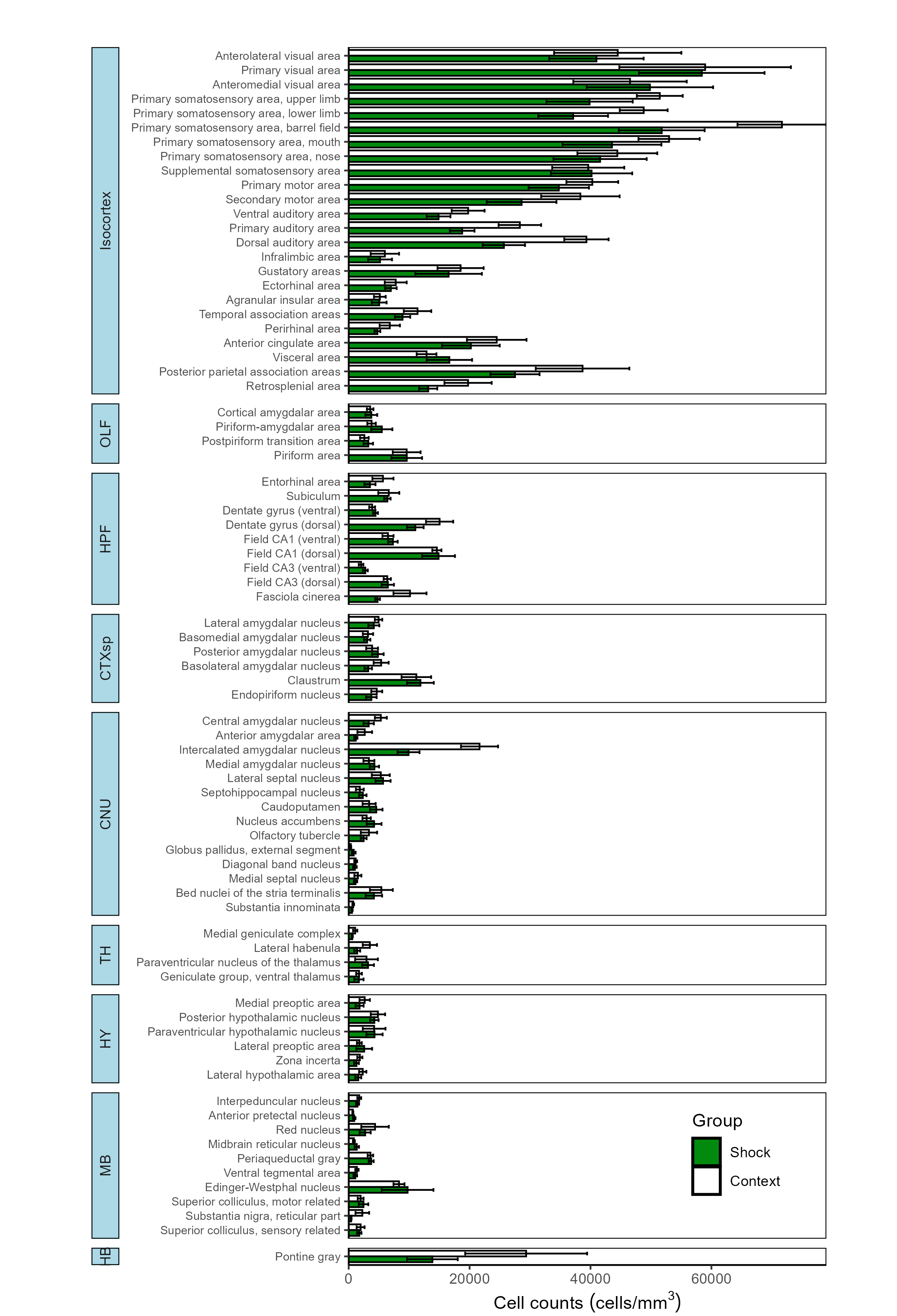
While the output of the following code chunks are not shown, this function can easily be called for the other channels.
Plotting all regions with mapped c-Fos counts
# Chose the group colors for the cfos channel to plot as a hexadecimal color code
cfos.colors <- c(Context = "#FFFFFF", Shock = "#ff2a04")

# Plot a long region bar plot
plot_normalized_counts(e = lh,
                       channels = "cfos",
                       by = "group",
                       values = list("Context", "Shock"),
                       colors = cfos.colors,
                       title = NULL,
                       height = 11, # Specify the height of the saved plot in inches
                       width = 7.5, # Specify the  width of the save plot in inches
                       print_plot = TRUE,
                       flip_axis = TRUE,
                       save_plot = TRUE,
                       plot_theme = plot_theme,
                       facet_background_color = "#FFFFFF",
                       image_ext = ".png")
Plotting all regions with mapped colabel/eYFP counts
# Chose the group colors for the colabel channel to plot as a hexadecimal color code
colabel.colors <- c(Context = "#FFFFFF", Shock = "#ffc845")

# Plot a long region bar plot
plot_normalized_counts(e = lh,
                       channels = "colabel_over_eyfp",
                       by = "group",
                       values = list("Context", "Shock"),
                       colors = colabel.colors,
                       unit_label = "co-labelled/EYFP+",
                       title = NULL,
                       height = 11, # Specify the height of the saved plot in inches
                       width = 7.5, # Specify the  width of the save plot in inches
                       print_plot = TRUE,
                       flip_axis = TRUE,
                       save_plot = TRUE,
                       plot_theme = plot_theme,
                       facet_background_color = "#e5f3e7",
                       image_ext = ".png")
3.2 Bar plot of normalized colabelled cells across user-specified regions
If you would like to quickly look at the percentage of normalized
colabelled cells for a few specific regions, you can also use the
plot_percent_colabel function.
This function is designed to take up to two mouse attributes to “map”
to the respective graphs aesthetics of color and pattern to display on a
bar plot. The rois parameter allows for selective plotting
of specific regions and their subregions of interest. Just enter in a
few acronyms as a string vector into the rois parameter.
Below we will plot any regions that are subregions of the the Dentate
Gyrus (DG) or the Cornu Ammonis (CA).
plot_percent_colabel(lh,
                     channel = "eyfp", # Channel to be used as denominator in counts
                     color_mapping = "group",
                     colors = eyfp.colors,
                     plot_individual = TRUE,
                     print_plot = TRUE,
                     save_plot = TRUE,
                     rois = c("DG", "CA"),
                     ylim = c(-5,40),
                     image_ext = ".svg")
plot_percent_colabel(lh,
                     channel = "cfos", # Channel to be used as denominator in counts
                     color_mapping = "group",
                     colors = cfos.colors,
                     plot_individual = TRUE,
                     print_plot = TRUE,
                     save_plot = TRUE,
                     rois = c("DG", "CA"),
                     ylim = c(-5,40),
                     image_ext = ".svg")
Note: The optional package ggpattern is required for mapping to the pattern aesthetic using the pattern_mapping parameter so make sure it is installed before running this function.
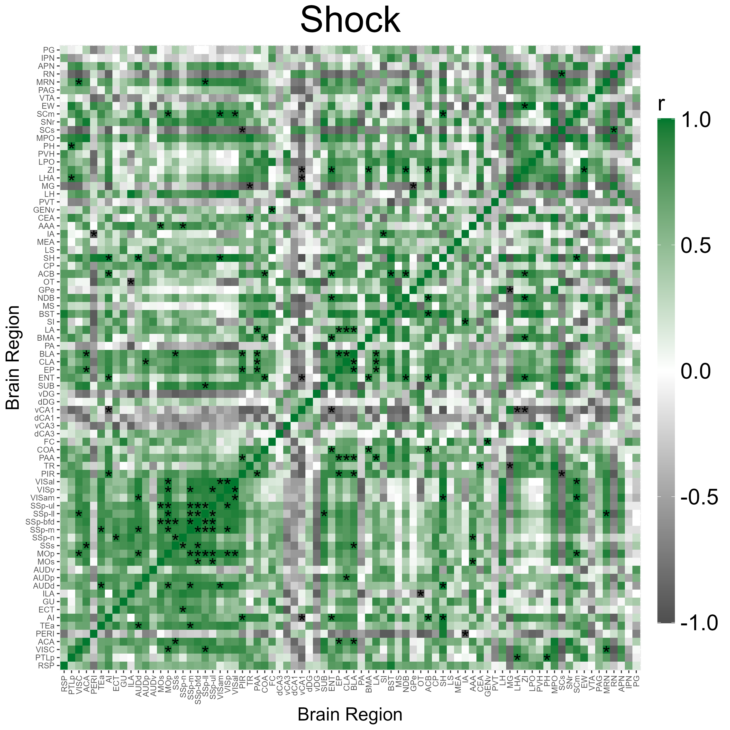
3.3 Correlation Heatmap Analysis
We can automatically plot heatmaps of the pairwise region
correlations using the function
plot_correlation_heatmaps(). Here we simply specify the
name of the correlation list and the respective colors (in a hexadecimal
string) corresponding to the channels that were specified in
get_correlations().
p_list <- plot_correlation_heatmaps(lh,
                          channels = c("eyfp"),
                          correlation_list_name = "Context",
                          sig_color = "black",
                          sig_nudge_y = -0.5, # helps center and shift the significance asterisks
                          print_plot = FALSE,
                          colors = c( "#00782e"),
                          save_plot = TRUE)

p_list <- plot_correlation_heatmaps(lh,
                          channels = c("eyfp"),
                          correlation_list_name = "Shock",
                          sig_color = "black",
                          sig_nudge_y = -0.5,
                          print_plot = FALSE,
                          colors = c( "#00782e"),
                          save_plot = TRUE)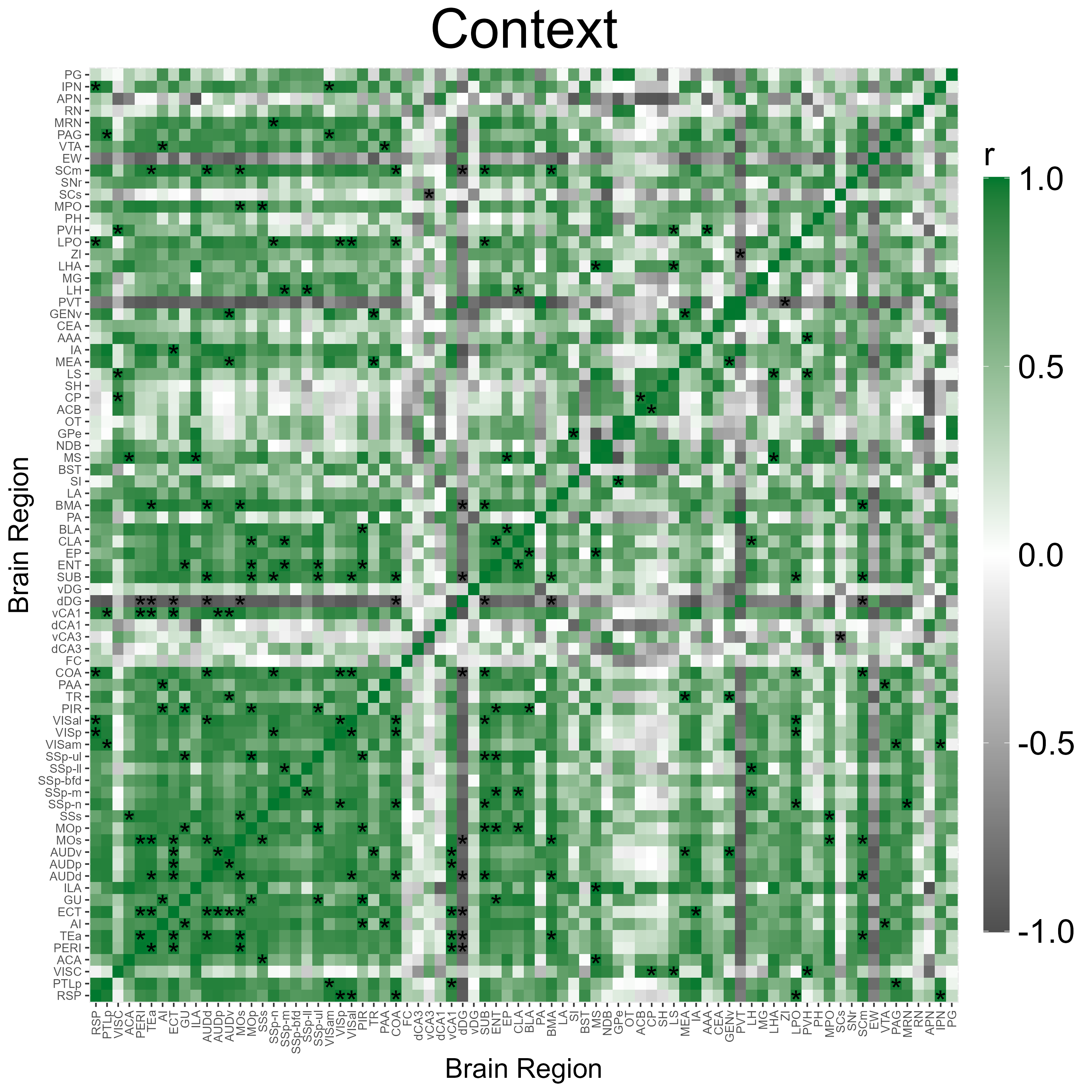
3.4 Visualization of correlation permutation analysis
volcano_plot() shows us a summary of the analysis
results, and plots the pearson correlation coefficient differences (CT
pearson coefficient - IS pearson coefficient) against their permuted
p-values against a null distribution.
The horizontal line represents the designated significance cutoff. The vertical lines plotted at +/- 1 allow for easier visualization of correlation differences that are large between groups. The colored dots in the upper right or left quadrants, including those which intersect the significance line, indicate the most significantly different regional connections between the groups, which have pearson correlation differences with a magnitude > 1.
# User optional theme to define the aesthetics of the plot using ggplot2 syntax
plt_theme <- ggplot2::theme_classic() +
  theme(text = element_text(size = 34),
        line = element_line(size = 1.0),
        axis.line = element_line(colour = 'black', size = 1.0),
        plot.title = element_text(hjust = 0.5, size = 36),
        axis.ticks.length = unit(5.5,"points"),
        axis.text.x = element_text(colour = "black", size =34),
        axis.text.y = element_text(colour = "black", size = 34))

# Plot a volcano plot
volcano_plot(lh,
             permutation_comparison = "Context_vs_Shock",
             channels = c("eyfp"),
             colors =  c("#00782e"),
             height = 8,
             width = 10,
             title = "",
             print_plot = FALSE,
             ylim = c(0,4),
             point_size = 2,
             plt_theme = plt_theme)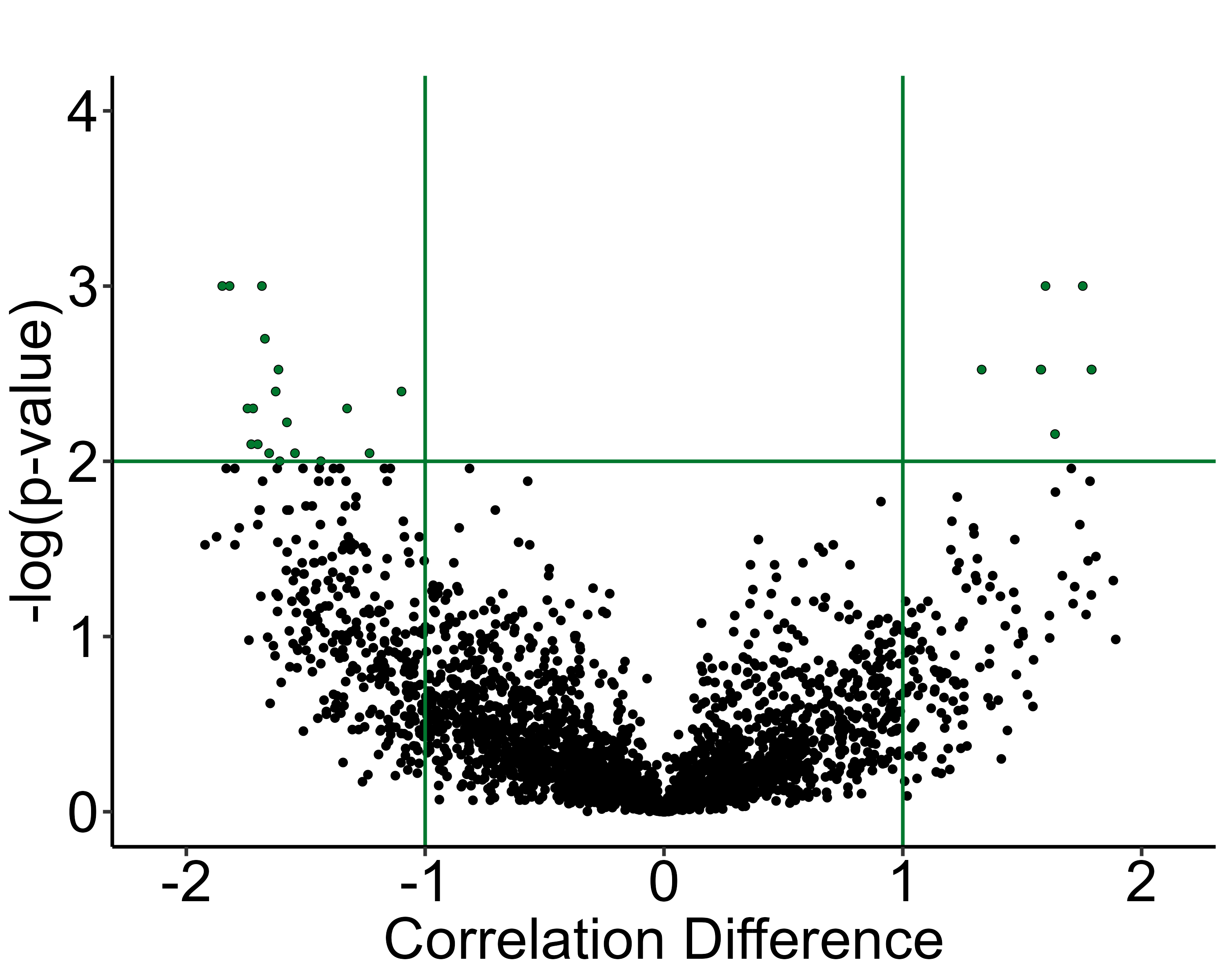
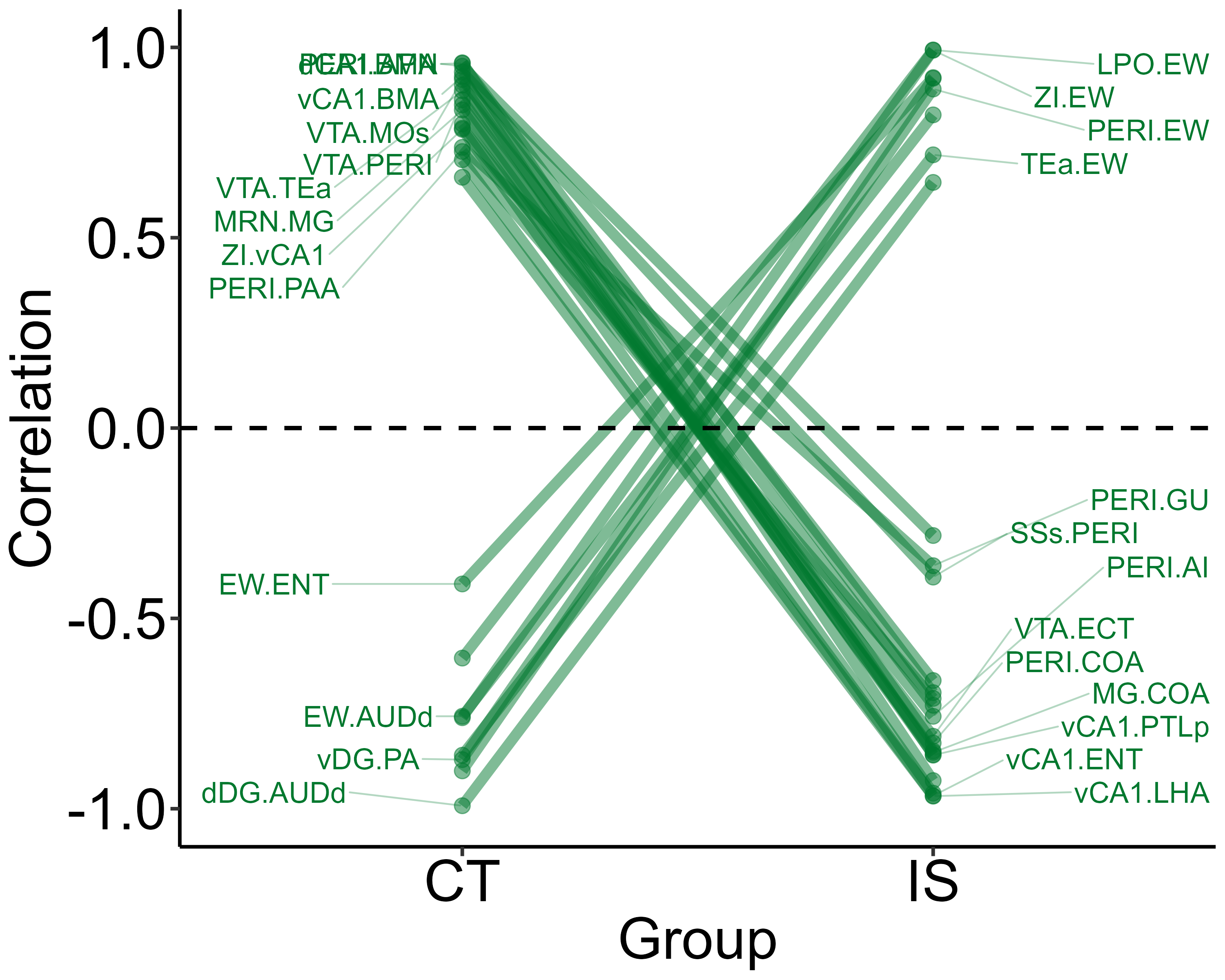
Next, we can better visualize which actual region pairs are different
between our two analysis groups and in which direction their correlation
coefficients change with parallel_coordinate_plot(). Only
region pairs from the volcano plot that are above the alpha level and
have correlation coefficient differences greater than absolute one are
included in this graph.
# User optional theme to define the aesthetics of the plot using ggplot2 syntax
plt_theme <- ggplot2::theme_classic() +
  theme(text = element_text(size = 34),
        line = element_line(size = 1.0),
        axis.line = element_line(colour = 'black', size = 1.0),
        plot.title = element_text(hjust = 0.5, size = 36),
        axis.ticks.length = unit(5.5,"points"),
        axis.text.x = element_text(colour = "black", size =34),
        axis.text.y = element_text(colour = "black", size = 34)
  )


# Plot a parallel coordinate plot
parallel_coordinate_plot(lh,
                         permutation_comparison = "Context_vs_Shock",
                         channels = c( "eyfp"),
                         colors =  c("#00782e"),
                         x_label_group_1 = "CT",
                         x_label_group_2 = "IS",
                         height = 8,
                         width = 10,
                         print_plot = TRUE,
                         label_size = 6,
                         plt_theme= plt_theme
                         )
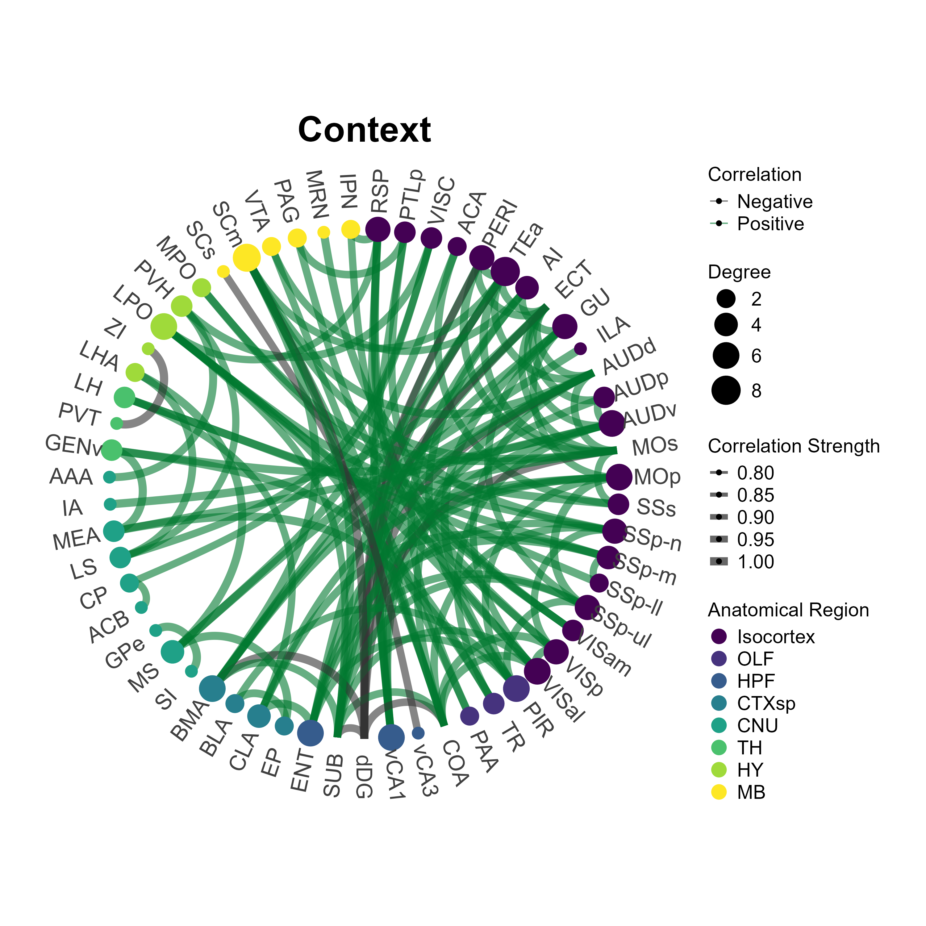
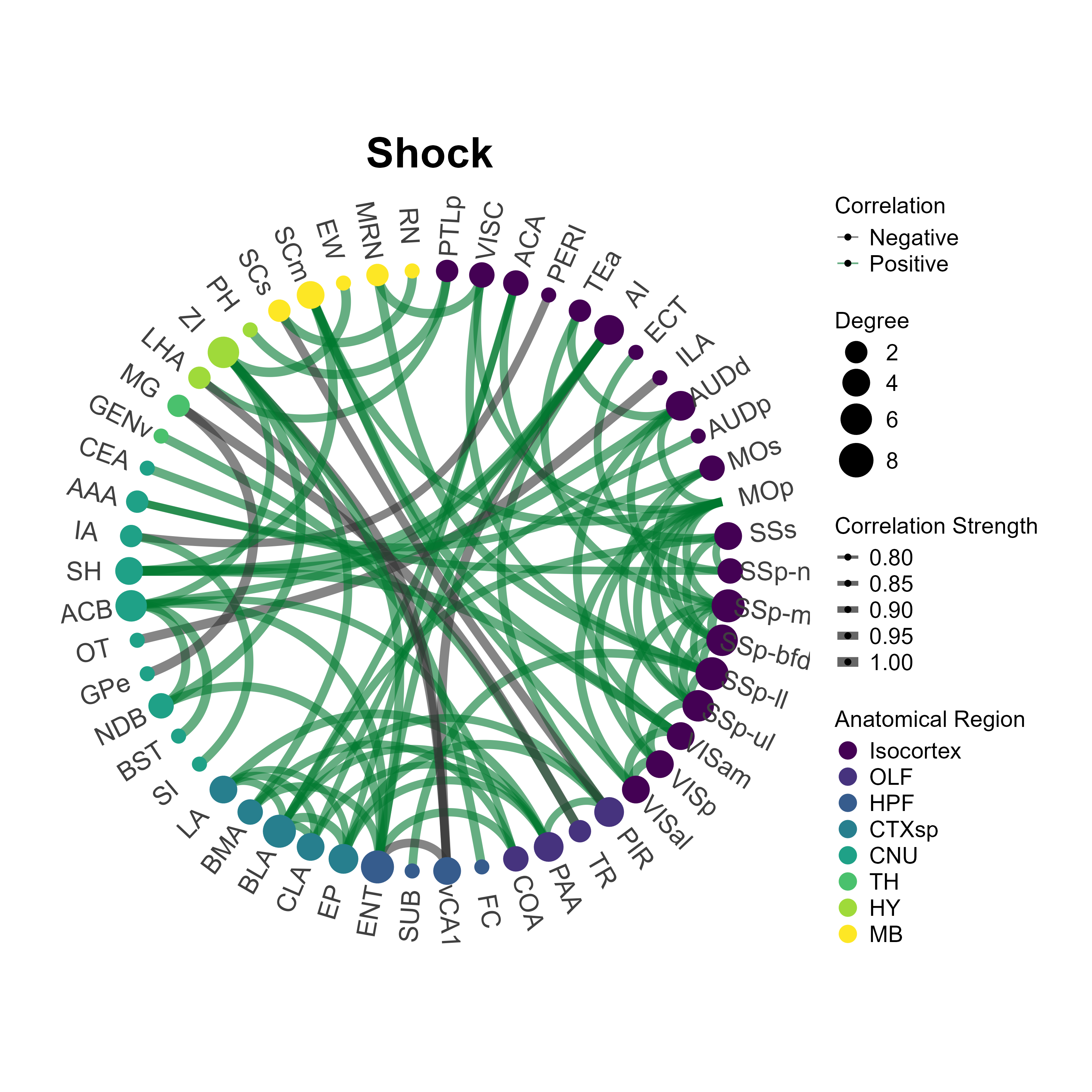
3.5 Plot network plots
The plot_networks() function automatically plots the
output of create_networks(). You must specify the name of
the network you want to plot. There a some customizable features such as
setting the edge color (taken as a hexadecimal string) for positively
correlated connections. Additionally, you can further customize
aesthetics by adding themes compatible with ggraph and
ggplot2 themes. Below we will plot the networks for the
eyfp channel in Context and Inescapable Shock groups.
# Custom ggplot and ggraph themes
graph_theme <- ggraph::theme_graph() + theme(plot.title = element_text(hjust = 0.5, size = 36),
                                             legend.text = element_text(size = 18),
                                             legend.title = element_text(size = 18))

plot_networks(lh,
              network_name ="Context",
              channels = c("eyfp"),
              title = "Context",
              degree_scale_limit = c(1,8),
              height = 10,
              width = 10,
              edge_color = "#00782e",
              label_size = 6,
              label_offset = 0.15)

plot_networks(lh,
              network_name = "Shock",
              channels = c("eyfp"),
              title = "Shock",
              degree_scale_limit = c(1,8),
              height = 10,
              width = 10,
              edge_color = "#00782e",
              label_size = 6,
              label_offset = 0.15)